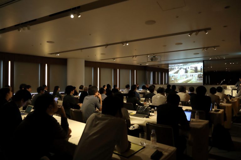
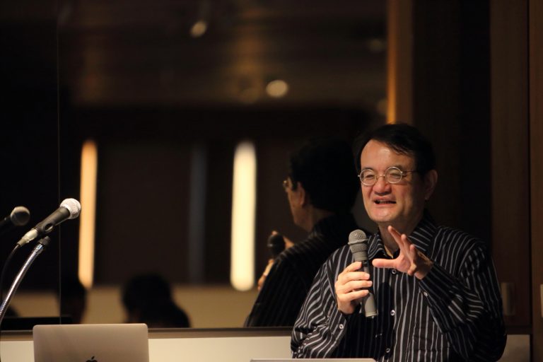
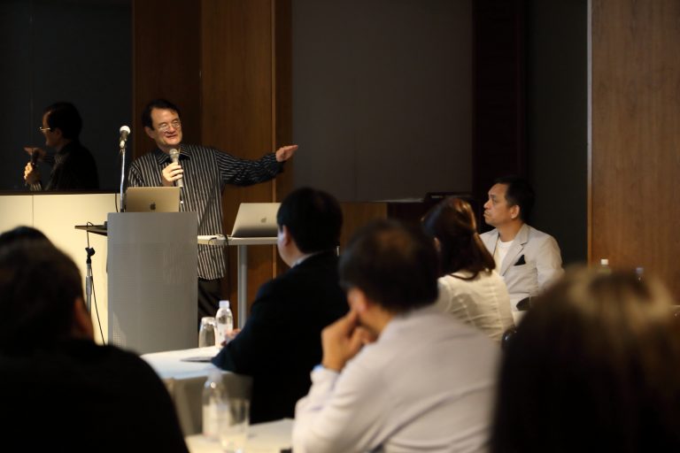
Summary of the 2nd AI Salon (Organized by Speedy, Inc.) “Kashikuso na Kikai” Keynotes Speaker: Toshiharu Yamanaka, Industrial Designer, Professor, The University of Tokyo

a machine that looks like it’s about to get a lot of money (e.g. a banknote)
〜AI Salon 2nd – Keynotes Speaker – Prof. Shunji Yamanaka, Industrial Designer, The University of Tokyo
Organized by Speedy, Inc.
Composition: Junko Io
Photo: Yukiko Echima
Dates: June 20, 2019
Location: Roppongi Hills
What is AI Salon?
This is a members-only salon brought to you by Speedy, a brand consulting company. How can companies utilize AI as a “business tool that can be used tomorrow”? We will work together every month.
2nd Guest / Mr. Shunji Yamanaka
Industrial Designer, Professor, Interfaculty Initiative in Information Studies, The University of Tokyo.
Born in Ehime, Japan in 1957, graduated from the University of Tokyo in 1982 with a bachelor’s degree in industrial mechanical engineering, and worked at the Nissan Motor Design Center. 1987- Independent freelance designer; assistant professor at the University of Tokyo from 1991 to 1994; founded Leading Edge Design in 1994; 2008-12 Professor at Graduate School of Media and Creative Studies, Keio University, and Professor at the University of Tokyo since April 2013. As a designer, he has designed a wide range of industrial products from wristwatches to railroad cars, and as an engineer, he has been involved in robotics and communication technology, designing the standard UI for Suica and other IC card ticket checkers throughout Japan. He has designed the standard UI for Suica and other IC card ticket gates throughout Japan, and at university he is researching new relationships between humans and things, such as prosthetic legs and robots that respond to the senses. Collection. He is the author of “Design no Koganei Hanashi” (Nikkei BP, 2017), “Design no Koskeleton” (Nikkei BP, 2011), and “Carbon Athlete: A Dream Drawn on a Beautiful Artificial Leg” (Hakusuisha, 2012).
Suika ticket checker and birth story
Hello everyone. I look forward to working with you today. First of all, I would like to introduce myself.
When I was a student, I studied mechanical engineering at the University of Tokyo’s School of Engineering, Department of Industrial and Mechanical Engineering, while drawing cartoons all the time. There, I learned that “industrial designer” was a job that allowed me to utilize both manga and mechanical engineering, and I joined Nissan Motor as a car designer. I started my career designing a car called “Infiniti Q45” and met Mr. Naoki Sakai, the president of Water Design Inc. The “O-product (OLYMPUS)” camera that I designed with Mr. Sakai attracted a lot of attention, and as a freelance designer, I had a very lucky start.
Other designs include cars, cameras, and ISSEY MIYAKE brand watches. For “OXO,” an American company known for kitchen tools, I designed a daikon grater called “Daikon Grater,” which received a G-Mark Gold Award.
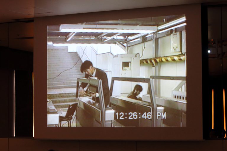
One of the most popular ones that you are familiar with is the Suica automatic ticket gate, and around 1995, JR was having a very difficult time with it. They tried to introduce the Suica system, which was the most advanced technology at that time, but it did not work well with people, and they could not get people to use it. Nowadays, we use cards to make decisions on everything, and everyone touches their cards in various situations. However, in the 1990s, the act of “touching cards” itself was still unfamiliar to people. Therefore, there were many people who did not understand that the card had to be placed close to a certain spot or that it had to be stopped for a moment. So, from the results of an experiment we proposed to JR, we found that “many people were touching their cards in completely different places.
After conducting various experiments to find the right shape, we finally discovered that when the following conditions are met: the card is in the front, it is tilted at an angle, and the angle is illuminated, people will naturally place the card where it should be. The design we proposed to JR was introduced in 2001, and the slanted automatic ticket gate that you are familiar with spread across the country. Thanks to the nationwide use of the same automatic ticket checker, about 80 million people in Japan now use these machines. Of all the products I have designed, this is probably the one with the most users.
Design is generally thought of in terms of color and shape, but I did not design the Suika penguin, nor did I design the color of the machine. As in the case of this ticket gate, when people and cutting-edge technology meet, it is the job of design to determine the format and how they should interact with each other. When it comes to the encounter between people and new technologies, I feel that this is exactly the situation we are facing now with AI. In other words, the problems that need to be solved by design are being revealed.

How to design an autonomous AI
As an example of our recent activities, I would like to introduce one exhibition. As part of a project of the Ministry of Foreign Affairs of Japan, there are “Japan House” cultural outreach centers in Sao Paulo, Los Angeles, and London. The Japan House has a gallery, and at the opening of the Japan House, there was an open call for entries for a traveling exhibition that would “represent Japan. Our laboratory was selected and we held an exhibition titled “Prototyping in Tokyo. Fortunately, it was very well received, with 94,000 visitors in Sao Paulo in two months, 47,000 in Los Angeles, and a whopping 111,500 in London.
The exhibition includes plot types created with various researchers at the University of Tokyo, such as “What can be done with the new technology of 3D printers,” and “What kind of interaction can be created with people using cutting-edge robotics? In other words, the exhibition is like a collaboration between designers and scientists. For example, robots made with a 3D printer are designed to be born directly from the 3D printer, rather than assembled.
Supported by today’s theme of “AI,” artifacts now behave in a very unique way. Artifacts are becoming the newcomers for us. Until now, they have been at the tip of our hands as tools, or fit our bodies as chairs, and cars have been such complex “extensions as tools”. The fact that these things are becoming autonomous is a very new theme for design. How should we design this autonomous AI? This is the main theme of today’s lecture.
Example of “smart-looking machine” design
I first realized this when I designed my first robot in 2001. Cyclops,” my first robot, was created for the opening event of the National Museum of Emerging Science and Innovation (Miraikan).
Just before Asimo was introduced, a robot called “P2” was introduced by Honda and was being talked about as being able to walk freely. At that time, we tried to make a robot from a slightly different perspective: “Cyclops.
What I mean by a different perspective is that there are moments when the robot looks very smart. So you thought, “I would like to cut out just those moments and turn them into a robot. It wouldn’t do any good, but I thought, “I think I can make something that looks a little bit smarter. …… At the time, an automatic tracking camera that was being developed in a foreign laboratory looked very smart. I decided to design it as a line of sight. We placed a lot of artificial muscles around the flexible spine. He is a very lazy robot and can only stand still, but the only thing he can do is “look toward people. He can twist and bend his body in subtle ways, so he looks at people with soft movements. I can also twist and bend my body in subtle ways, so I can look at people with soft movements.
I noticed something when I created this “Cyclops”. This is just an automatic tracking camera, but if you design it well, it can look very smart. This is an illusion, of course, but I thought that when designing a truly intelligent machine, this would actually become an important element. In other words, “design it in such a way that you can tell how smart this thing is. I cut out the “line of sight” as an element of cleverness, designed it, and made it into a plot type.
In 2007, I also created a robot called “Ephyra. For an exhibition called “TOKYO FIBER,” organized by graphic designer Kenya Hara to explore the possibilities of Japanese textile technology, I created a robot with 12 cylinder arms arranged in a radial pattern inside a highly elastic cloth woven into a tubular shape. Although it was a fabric exhibition, in my mind, I wanted to make a new attempt at a new robot design. There are various situations in which a robot looks like a living creature, but simply “making it look like a living creature” is the usual way. So, “making it look like a human,” “making it look like an insect,” “making it look like a panda,” and so on, but on the other hand, one of the themes was, “Can we make something that feels like a living thing, even if it does not look like a specific creature at all? What we did was to place many cylinders with touch sensors on the tips and throw these in the middle of a stretchy cloth. Then, the programming is that the touch sensor is attached to the tip, so when someone touches it, it retracts quickly.
Elements of animality. And where do we begin to discern the elements of it being an autonomous object? We can easily distinguish between what is dead and what is alive. We also instinctively and immediately notice what state and what it is doing that seems wise. Designing from the perspective that perhaps we can design it to do that well. In the process of creating robots like the one I introduced, this perspective gradually emerged and became an awareness of the problem.

Designed to look alive
The same process applies to the approach to mechanical systems. When one tries to make a living creature-like machine, one inevitably tries to make it resemble the structure of a living creature. For example, “Let’s make artificial muscles,” “Let’s make an artificial skeleton,” and “Let’s make it out of soft materials. However, the “Flagella” robot was born out of an experiment to see if the elements that make us feel like a living creature might actually exist in a slightly different place. Flagella” is a robot that moves, but it is not made of any soft material, but of a hard material. It is made of hard material, but not of soft material at all. It is just hard material slightly bent, connected, and twisted, but the curved surfaces are very carefully designed so as not to break the sense of three-dimensional continuity. By doing so, the arm appears to move very smoothly, even though it is only twisted by two or three motors. It is a mass of mechanical parts, but as a result, it is able to achieve smooth movement.
An assistant professor in my lab, Mitsuru Muramatsu, recently built a robot that won the top prize at the Asian Mediato Awards. He built it with a German researcher, though. Ladies and gentlemen, please imagine the movement of a human being when he/she balances. The muscular movement of “getting back to normal” when we lose our balance takes place in every leg muscle, but it is not always conscious. So, defying external forces is our basic behavior. Even babies, when you grab their hands and pull, they pull back, right? Someone who realized that this kind of behavior is fundamental developed a motor that is loaded with parts that only defy external forces. So you tried to use that to give two muscles a strange object that can move around with that motor at will. Then those two muscles have no sensors for the outside, so they just go against the force exerted on them, but they repel the force exerted by gravity. the two motors seem to be working together, but they are not directly connected. But they act against a single purpose, and the result is something that is always trying to stand up. If you put them in a mean posture, they will try very hard to find a stable posture and stand up, and this gesture makes them feel very primitive creatures. It’s like, “Come to think of it, animals might behave like this all the time …….” It looks like a baby trying to stand up. When it finds a stable posture, it walks as it is. And when an external force is applied again, it starts doing something different, which is a little bit strange object.
Both robotic examples reproduce a kind of reaction of a very primitive creature. We have also designed several robots of this type, although they are a bit different from advanced AI.
Eye movements “express intelligence.”
There is a small face robot that has been the talk of the town, created by an artist named Takayuki Todo. Although this robot is not equipped with an AI, it has a very lively expression on its face.
What makes it so is that he approaches the design of the gaze very carefully. In general, robots that closely resemble humans can move their eyes, but they do not stay their gaze. In other words, when a human looks at something and shakes his head, he shakes and tilts his head while looking at it to some extent. So if there is an object of interest on the way there, they quickly change their gaze. He reproduced just that movement very carefully. He recognized the object with a scanner and programmed it to “stare at the face of the scanned human being,” that is all.
In many of the so far humanoid robots, when you shake your face, your eyes are also waved as they are. However, if the robot stays its gaze while shaking its face or keeps its gaze on an object, we instantly recognize that “this robot is aware of something. I also think this design is very important and very effective.
Moreover, he designs it quite consciously. He initially created a robot that looked exactly like the face of a famous idol and was called “creepy. He carefully searched for the main reason why it looked weird, and realized that it was the gaze. As a result, he came up with a robot that does not look like a human, but looks lively enough with just its gaze, even though its face, mouth, and nose hardly move, and it even seems to have emotions. His robot, whose eyes move up and down when he shakes his face, is designed so that the eyelids follow the movement of the eyes. This is another human characteristic. On the other hand, the typical behavior of a robot that is said to be “creepy” is to scurry around with its eyes wide open. But his robots always have eyelids that come down when they look down. In other words, it also achieves the motion of eyelids moving along with the eyeballs. As for the eyebrows, they are very simple, just vinyl tubes with actuators at the ends, but this is a rather cartoonish technique, and by intentionally changing them, he also achieves a proper emotional expression.
This is a very emotional looking piece of work, and he is now being sought after at exhibitions all over the world, including one in Germany. The first time he exhibited his robot was at an exhibition we organized at the University of Tokyo, and when I happened to see him presenting a video of this robot on Youtube, I thought, “This is a robot that realizes something very important. So we asked him, “Would you like to participate as a guest at our laboratory’s exhibition?” We asked him to join us. It became a very popular topic of conversation, and about 5,000 people showed up. Since then, he has made great strides on a global scale and has become an artist who is truly active in various fields.
When I saw this work of his, I felt that although he was not directly creating a human face, he and I were in the same boat. In other words, I resonated with the very carefully designed design elements of “what works for people,” “what looks intelligent,” and “what kind of movement people perceive as lively.

What’s important about AI is that it
Design that appeals to the “unconscious
A similar approach, although different in shape, is that the designers in our lab are now trying to create an AI agent. There is a lot of work going on right now to give AI various three-dimensional objects, isn’t there? In China, there are a mountain of tabletop robots that claim to “support your life,” but those who have experience with humanoid robots or robots with eyes and noses are usually disappointed to find that they are not as useful as they thought they would be. On the other hand, speaker-type robots that do various things when you talk to them do not do much other than play music (laugh). The The aforementioned researcher therefore asked himself, “What is the design that can honestly convey what it can do at a minimum?” He created a robot with only one function: “A simple sphere makes a flat surface and turns toward you when you call out to it. Surprisingly, the design of the robot’s attention was such that it “recognizes people” and makes people think, “Now, let’s talk to it. I feel that designing such a small recognition is actually becoming a big hint.
When we look at the AI situation in China, how will AI enter our society and what impact will it have? I believe there is definitely a future that can be seen from this. The robots I have introduced today are not immediately applicable to society, and some people say, “You are making only useless things” (laugh). The project is underway.
In summary, we are slowly trying to solidify a “smart-looking design approach” for the future. One of the several things we discovered in the process is that simplicity is very important. For example, it is easy to add a smiling expression anyway or do something unnecessary, but in reality, designing such complexity beyond our ability is actually a negative thing. So there is no value in designing complexity in itself. I think it is also important not to forcibly make it resemble a person or a creature.
On the other hand, it is important to design the body to be simple, yet very delicate in behavior. Some of you are web designers, especially interactive web designers, and you are well aware of how important factors such as speed change, reaction, and timing are. They are very important in the real world as well. I think it is very important for interactive web designers to properly bring what they are doing now to the real world.
To begin with, beauty is difficult to explain because it is a philosophical matter. Artists often say to me, “Designers use the word ‘beautiful’ so carelessly,” but in my mind, “beauty” means a kind of perfection, soundness, or soundness. I think of it as a sensor for what is going well. The human instinct is to find food that has been grown wholesomely. Or to find a healthy opposite sex. Or to find a very capable adversary. I believe that beauty and aesthetics exist as sensors of what is going well, whether in everyday life or in scenes where we perceive danger.
Similar to gastronomy, for example, taste was originally supposed to be the ability to discern what is necessary for health, right? Therefore, the act of eating good food was supposed to be directly connected to health. But somewhere along the way, humans have subtly cooked it, stimulated it, and turned it into something new and pleasurable. Children basically don’t like stimulating things like spices. It is because they are likely to be basically poisonous. However, if we can develop a technique that subtly smothers their danger sensors while at the same time making them taste good, we can provide more than just “sweet” or “spicy,” but a level of satisfaction beyond what they are looking for. It is a kind of cultural perversion.
Something similar is happening in the aesthetic sense. What is “cool” or “beautiful” in our space can be sensed in the midst of very complex fashion trends or surrounded by complex man-made designs. I believe that beauty is fundamentally a sensor of health that is related to our instincts. So, at least with this new approach, I would like to make it beautiful in a very simple way. Smooth movement, smooth body, delicate three-dimensionality, delicate light, and so on. I used the word “unconscious,” but fundamentally, I believe that design that appeals to people’s unconscious is powerful and important.

Toward “Design for Behavior
We are always sensing things like instinctive life and death, intelligence or lack thereof, and ability with respect to others. And we now rely on voice-recognition-like things because the artifacts are still basically command-based, right? In other words, most artifacts are working on the basis that we give commands or receive reports, such as “do XXX” or “I did XXX”. If this world becomes even more autonomous, if AI becomes basic, and if all artifacts naturally support us, then we will have to ask what they are doing now, whether they are in a normal state, whether they seem busy or not, what kind of abilities they have, what more they can do, and so on. We need to keep estimating what we can do to help ……. I believe this is the most important factor for the advancement of AI technology.
As I mentioned at the beginning of this article about the example of the Suica ticket gate design, when new technology meets people, there are generally various discrepancies that occur. Situations can easily arise where people want something different from what they expected, or even more than what they expected. Although it is not so easy to transition from our current lifestyle to that, it is still important to properly design the factors I mentioned in order to make the transition smooth and to obtain a happier life for us… …is the thrust of today’s lecture.
I am not an expert in AI, and I am hardly qualified or capable of giving detailed information on the development of AI and the current state of the technology, but when I am trying to design something new, I can’t help but imagine a future where it will be autonomous. I feel that it is very important to design styling, design, design of movement, and design of behavior to make people happy, and I would like to continue to create a variety of products in the past and in the future.
That is all I have to share with you today. Thank you for your attention.
(End)


